
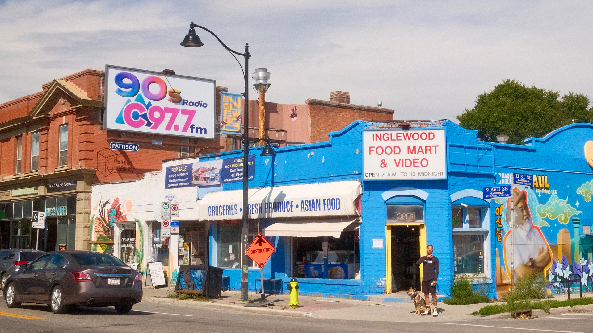
It all began at a brunch booth, the way the best projects often do. Trent sat down with an old colleague after months of silence, the kind of catch-up where years compress into hours. There were new roles, new agencies, new places and new projects in the air. The conversation swept forward until one piece of information caught Trent's attention. Mark had landed a branding project for his neighbourhood: Inglewood, Calgary's original main street.
For Trent and me, this was almost nostalgic. During our years living in East Village, we regularly crossed the Elbow River on foot to wander Inglewood's tree-lined streets. We knew the riverside trails, the independent shops, and the cafes tucked into heritage buildings. When Mark mentioned the Inglewood rebrand, something clicked. Without hesitation, Trent offered to refine the new brand's typography. What started as a coffee-shop conversation became weeks of dedicated work.
Watching Trent develop this font system reveals the immense labour hidden beneath the letters I'm using to write. Designing a full-fledged accessible typeface demands obsessive precision. Each glyph must function across several weights, contexts, and environments from a street sign to a mobile screen. I have always been drawn to typography, but my strength lies elsewhere. Where I operate in the macro connecting strategy to execution, Trent operates in the micro detecting discrepancies invisible to most. That tension between the big picture and the minute detail is precisely why our collaboration works so well. He catches what others miss. I ensure what he builds serves the broader vision.
Once the typographic foundation took shape, the next phase brought us back to Inglewood. We returned not as tourists this time, but as researchers with cameras in hand. The goal was twofold. First, we sought to understand how the neighbourhood's visual language communicates identity. Second, we identified where the refreshed brand could integrate organically rather than impose itself.
After weeks of work, we dedicated an afternoon in Inglewood to capture where the brand has been implemented and where the developed typeface might live in the near future. We started the afternoon at the dog park by the Bow river. Soba had a lot of business to attend to, so we let him do his thing for a while. The grass was fresh, the light was high and bright, and the neighbourhood was already busy. We gave him fifteen good minutes before heading onto 9th Avenue and walking down toward the Elbow.
Our first destination was Kent of Inglewood, a store Trent has a particular affinity for. He has spent years building a deep interest in knives (cooking, utility, and everything in between), the kind of functional, well-made tools that sit at the intersection of craftsmanship and daily use. Kent of Inglewood carries that world, and also serves as one of the carriers of the neighbourhood's own merch, making it a doubly valuable stop. But the store had relocated. We stood at the old location, peering through the glass at the familiar signage on the doors, trying to figure out where to go next. A worker from the neighbouring store clearly noticed us studying the signs and came out to the sidewalk before we could pull out a phone to look up the new address. It turned out they had moved just a block down, toward the Elbow. Exactly the direction we were already walking. We thanked him, and the small moment of confusion dissolved into a little detour that felt very much in keeping with the neighbourhood's character.
We kept walking, and I kept my camera out. The street had quirks we wanted to capture. A faded mural peeking out from behind a Vietnamese restaurant. A collage of stickers on a street lamp. Each frame was a reference point for how texture, materiality, and context shape identity in the physical world. A typeface carries different weight on a printed sign versus a screen. These observations would later shape the typeface's case study, grounding it in physical reality.
When we finally reached the new Kent of Inglewood, the split in our roles was immediate and natural. Trent walked up to the counter and got into a conversation about utility knives with the people working there. His eyes lit up. He was asking about blade steels, handles, the small production runs. The staff were friendly and clearly enjoyed the exchange. While he talked, I stood at the window and photographed the neighbourhood merch that had been thoughtfully laid out. Pins, tote bags, and stickers were grouped in a way that told a small visual story about Inglewood itself. I shot from inside, as it was intended from the arrangement. I wanted to capture not just the objects but the context. The way the light fell through the glass, the human scale of the display.
Our next stop was Rich Dogs, a neighbourhood hot dog stand I had seen advertised on the local news the week before. The owner makes countless different kinds of hot dogs, but only serves a couple on any given day. Today the menu was a nacho dog and a Thai dog. We both went with Thai. The buns were toasted, and that’s all I ask of a hot dog. Two of us eating on a 9th Avenue sidewalk, watching the traffic pass, felt like the right kind of stop for this mid-afternoon adventure.
On the walk back, I kept my camera out. I wanted a few shots of Trent and Soba across the street from the Asian market. The building is electric blue, a bold and specific shade that gives the block a lot of character. It makes a strong backdrop. Soba trotting, Trent mid-stride, the blue wall behind them. A few frames. Good enough. We headed back to the van feeling accomplished, the memory card full and the day still young.
This fieldwork directly feeds our studio's mobile-first practice. Too often, brands exist purely in the abstract. They are designed on desktop screens and deployed without consideration for their lived environment. Our approach reverses that flow. By documenting Inglewood's streetscape, we capture the conditions under which the brand will actually live. Daylight versus evening lighting presents one variable. Contrast challenges emerge from urban signage against varied facades. The electric blue wall. The amber brick. The sticker collages. These are the environmental parameters that a brand must survive within.
This project crystallizes a philosophy that increasingly defines our work. Authentic design begins in the world, not in isolation. Interfaces shouldn't be designed to look good in a vacuum. Instead, we build design systems that translate consistently across environments. Whether someone encounters the brand on a storefront awning, on a tote bag at Kent of Inglewood, or on a website, the visual language should feel intentional and appropriate to the context.
The typeface Trent developed embodies this principle. It’s aesthetically refined and designed for flexibility across media, sized for readability on small screens, weighted appropriately for outdoor visibility, and crafted with accessibility considerations baked in from the start.
As we continue integrating this neighbourhood research into our mobile design practice, the lessons extend beyond Inglewood. The discipline of walking through spaces with purposeful documentation now informs how we approach any place-based client. We photograph merchandising, signage, textures, and light conditions. The neighbourhood becomes a living design brief.
When someone walks through Inglewood looking at their phone, unaware that the interface they are using grew out of conversations at a brunch booth and an afternoon spent photographing window displays and eating Thai hot dogs on a sidewalk, that is when the work has truly succeeded.


studiopumpo.com