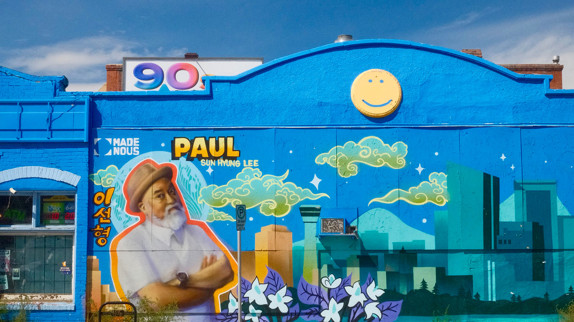
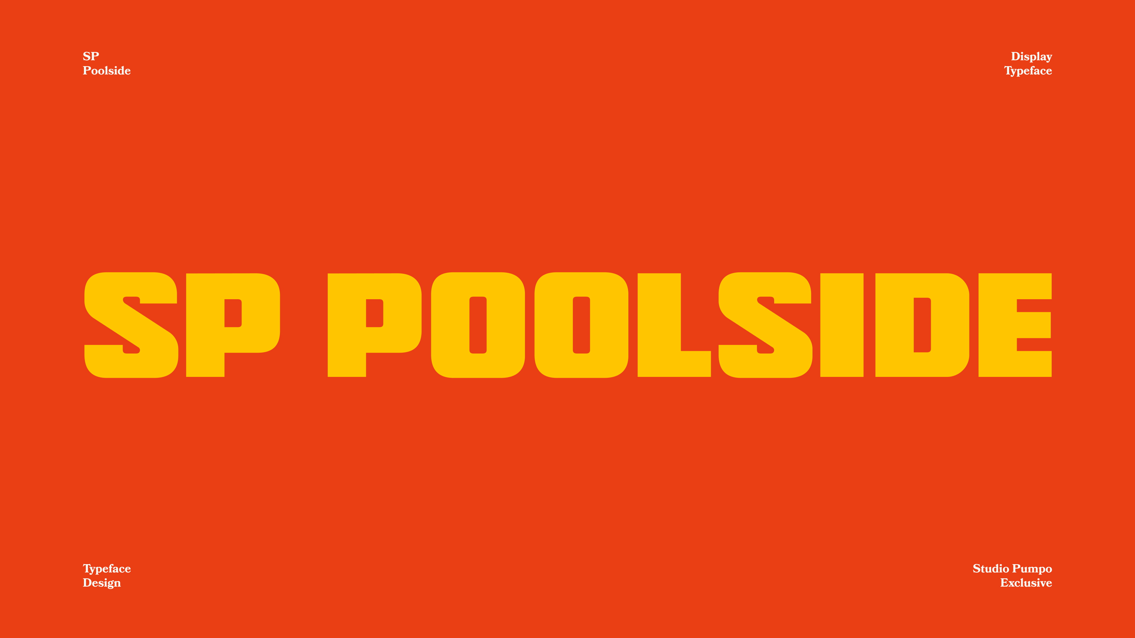
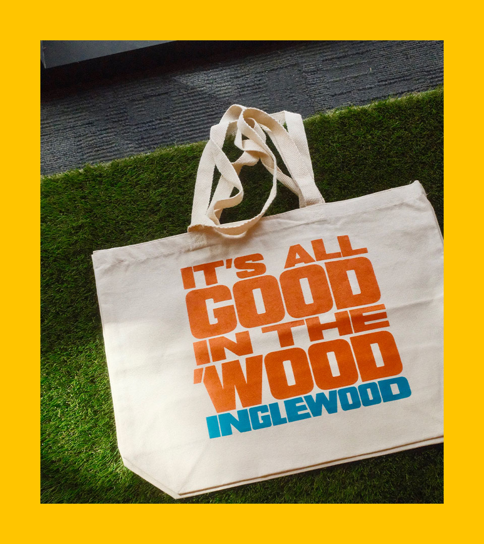
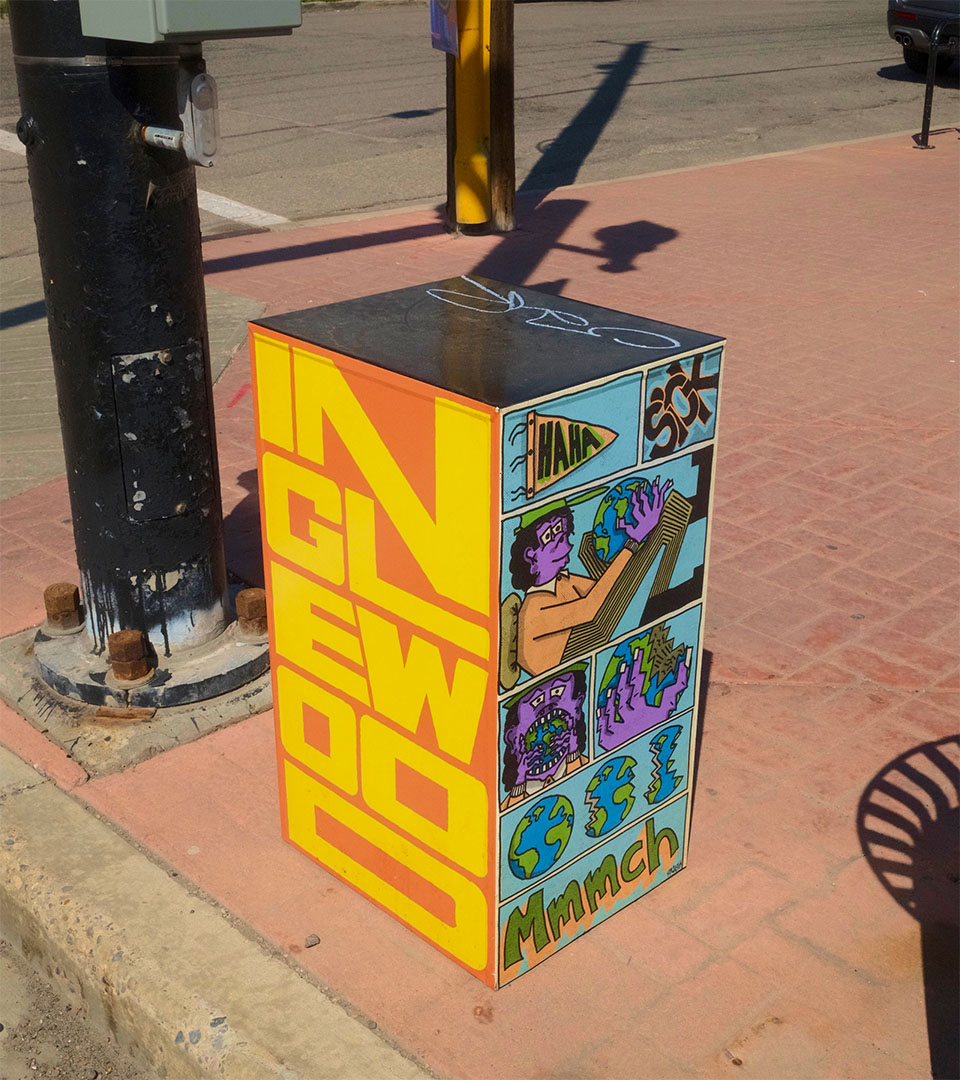
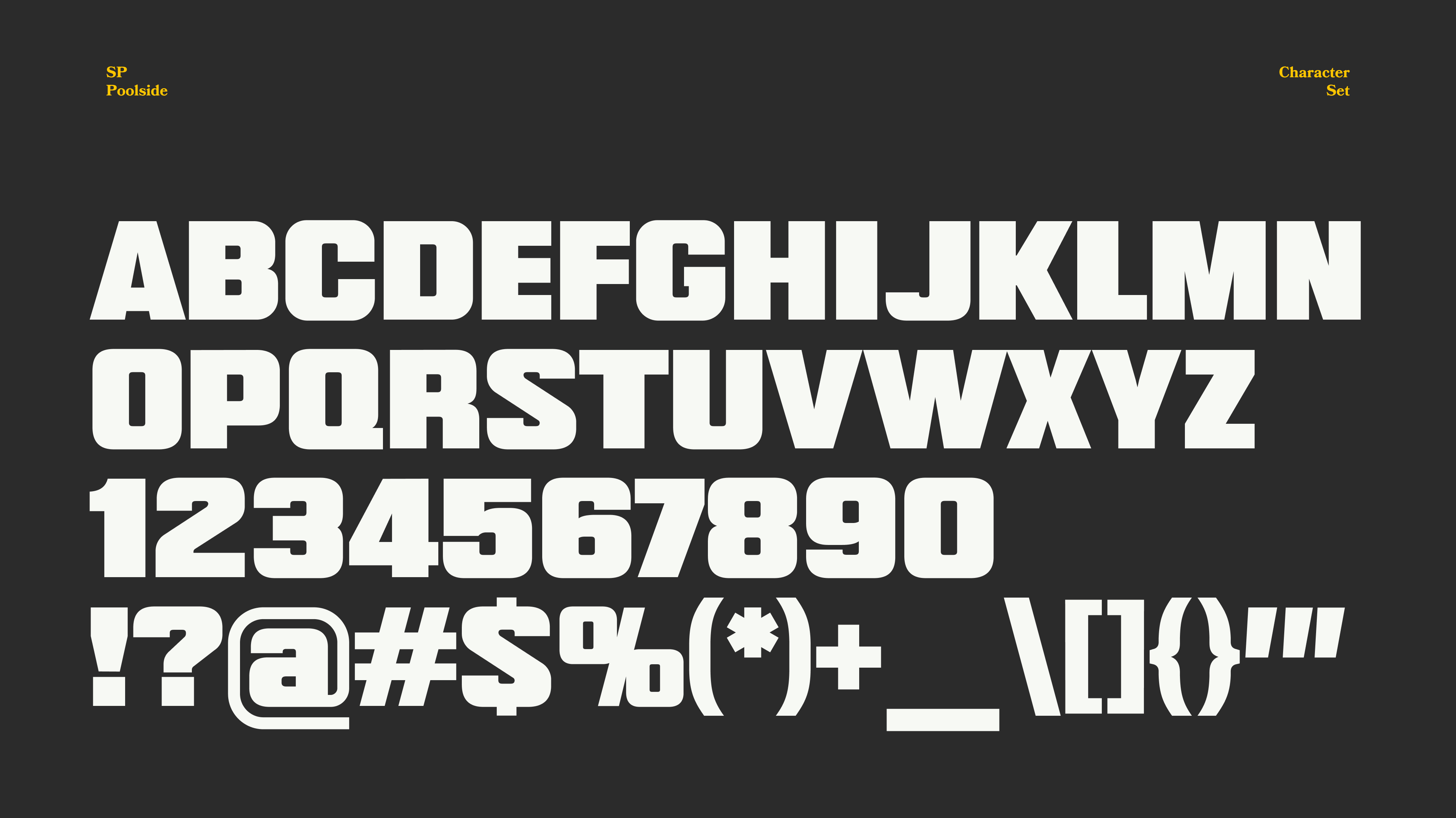
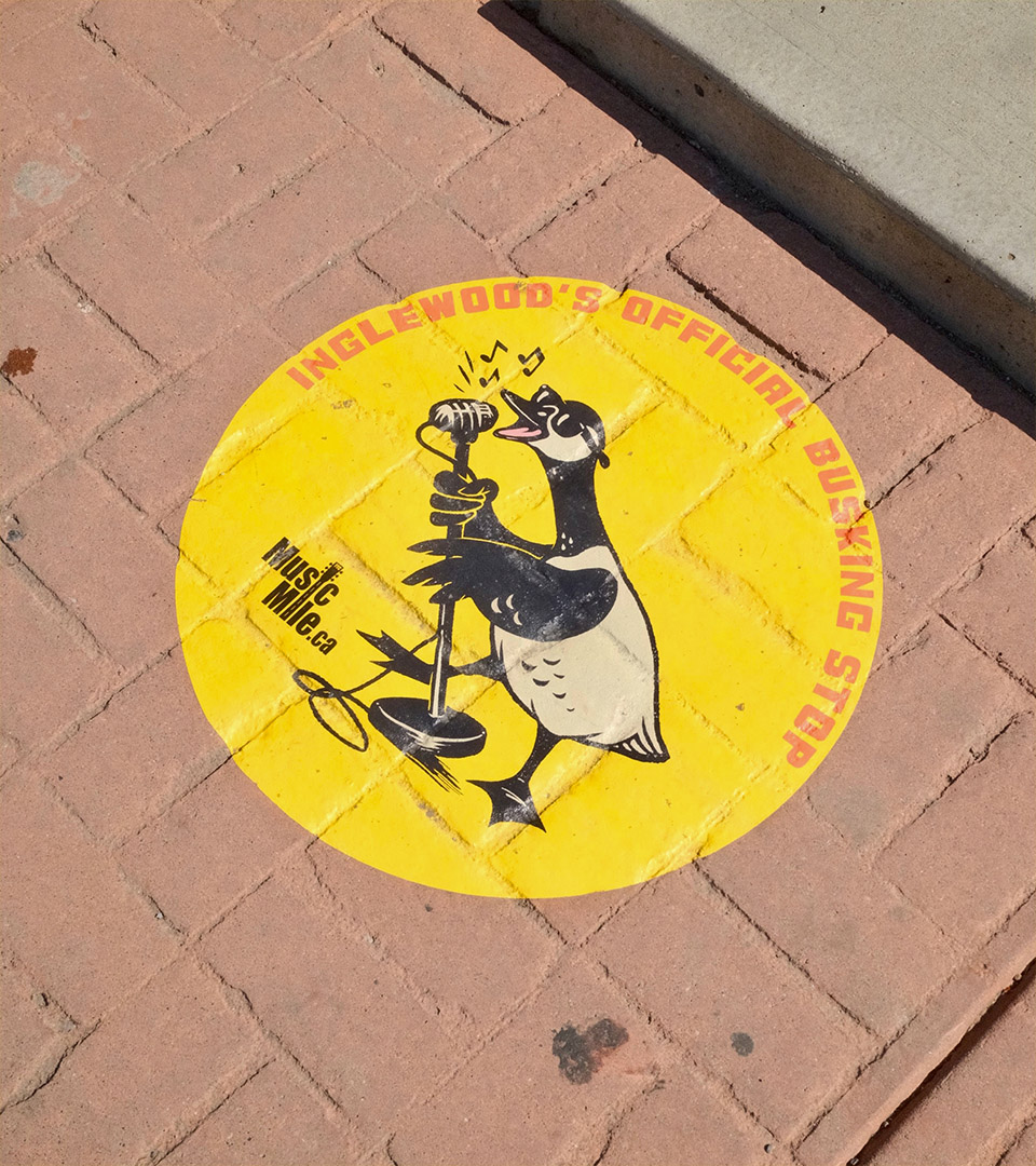
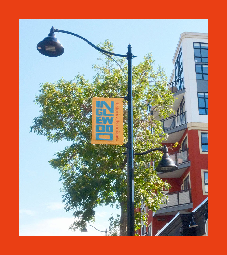
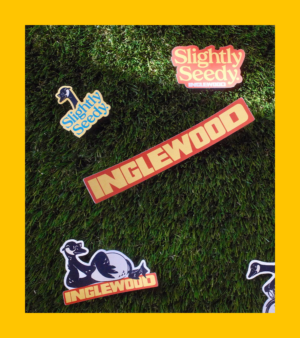
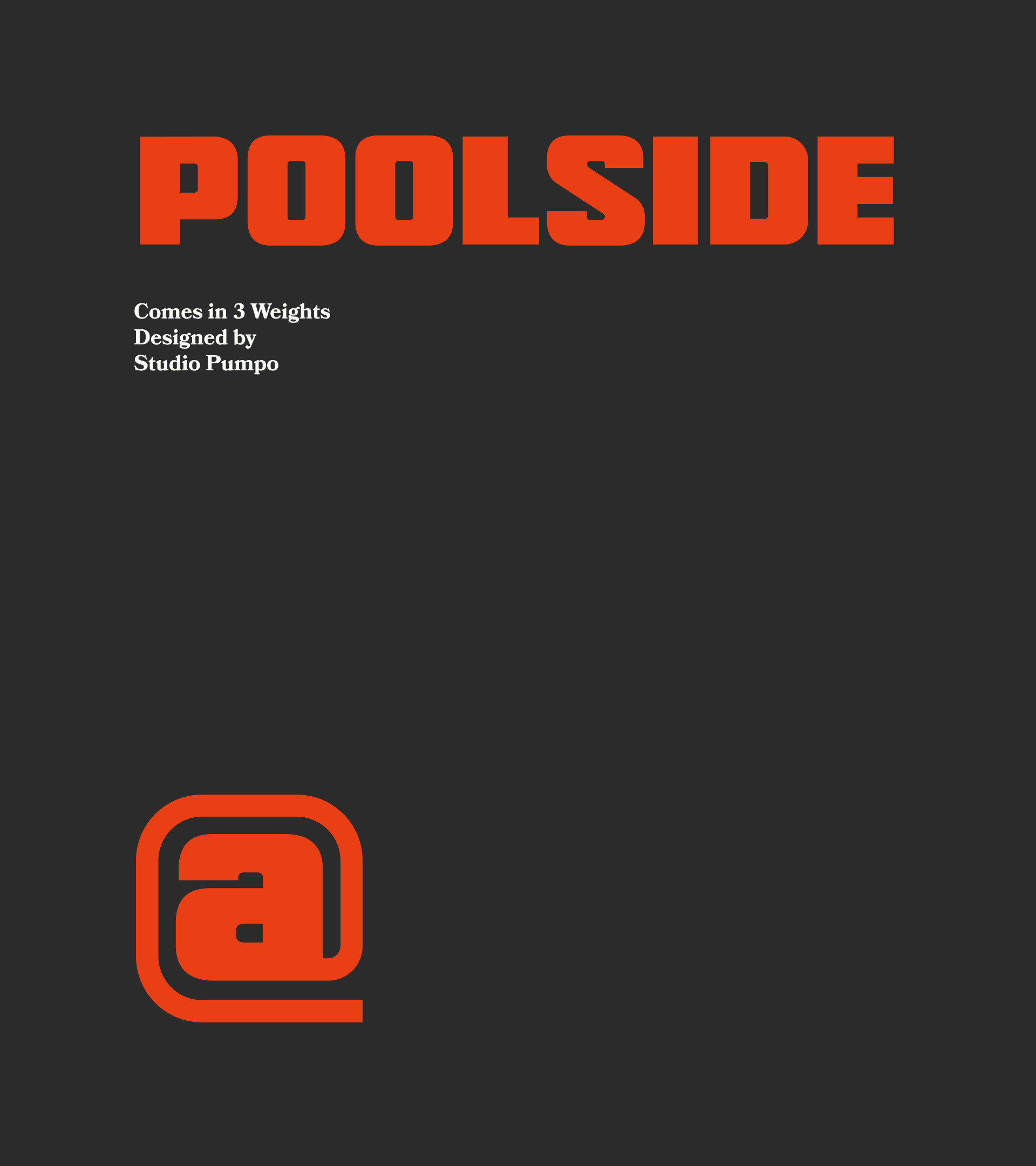

Inglewood is Calgary's historic riverside quarter, a neighbourhood of tree-lined sidewalks, heritage storefronts and a passionate community. When the neighbourhood undertook a rebrand by Mark Rowe, the assignment came with the constraint embedded in the place itself. The typeface commissioned as part of this refresh had to function as an operational asset for an entire commercial main street, spanning signage, merchandise, print, and digital. Our studio's connection to the neighbourhood went beyond the brief with years of having lived and wandered these streets.
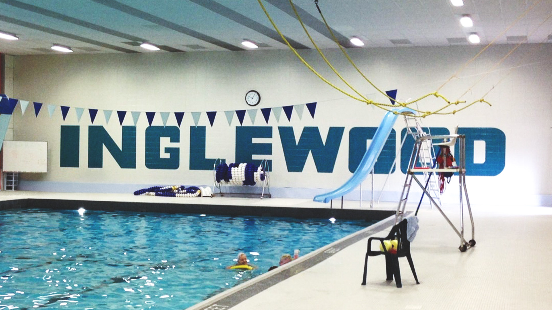
The project's origin sits inside the Inglewood Aquatic Centre. Bold block letters that have quietly framed swim lessons, gatherings, and decades of shared memories. This letterform had survived because it was woven into daily life.
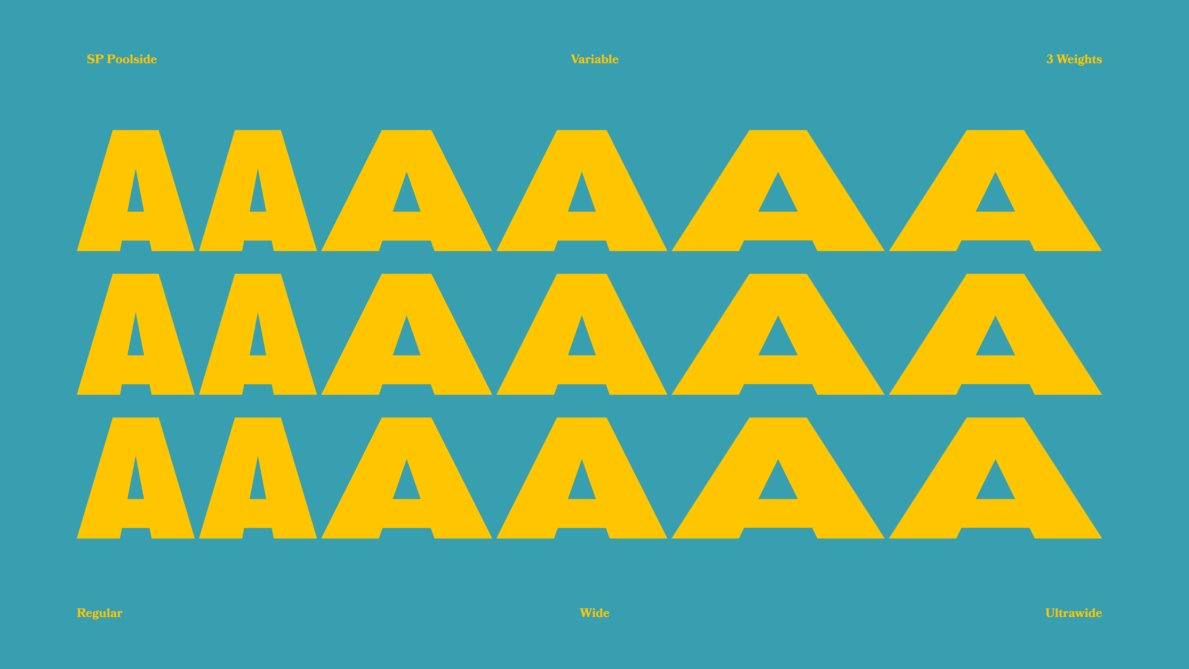
Every glyph was built to function across multiple weights, contexts, and environments (legible on a mobile screen, bold enough for outdoor visibility, and shaped with accessibility standards in mind). The result is a typeface system engineered to integrate organically into the neighbourhood, so that when a passerby reads the brand on their phone while walking 9th Avenue, the interface feels like it grew out of the street itself.